A Little Help Goes A Long Way - Postal History Sunday
Welcome to this week's Postal History Sunday! As we enter the final month of the year I am forced, once again, to reconcile myself to some of the realities of the academic year. Those of you who have connections to schools, colleges or universities can probably relate to this. While I am no longer directly involved, my lovely bride is. As a result, I get to live the life of the school cycle vicariously!
To put it succinctly, December typically goes by in a blur.
And so, this week, I am going to focus on some of the aid I have received from many other people as I seek to learn more about postal history. For those of you who do not do much with postal history, it might be interesting for you to learn that there is a community of people who enjoy this subject. That community is often very willing to share information and knowledge. And, if you are involved in postal history, you are already aware of that community, or if you aren't, I should encourage you to participate!
As I started to gather material for this article, I realized I was going to have more than I could reasonably manage to put into one blog. So, I am going to focus on items where I received some help from the members of the Facebook Postal History - Covers and Stationery group, started in 2017 by Manny Brautigam and Mark Goodwin. I suspect a future PHS or two will feature other forums.
Pretty Covers Deserve Good Descriptions
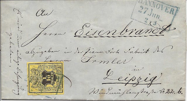
The folded letter sheet shown above was mailed in Hannover (Hanover) on Jun 27, 1854 and was destined for Leipzig, in Saxony. Hannover was the major city in the Kingdom of Hannover at the time. This German State comprised most of northwest Germany, bordered by the Netherlands, the North Sea and the River Elbe. The Kingdom of Saxony was located southeast of Hannover and travel through other German States was required to get the letter from one place to the other.
Hannover was a member of the German-Austrian Postal Union (GAPU), which had a collective postal agreement that set rates based on a combination of distance and weight. This particular letter was a simple letter weighing no more than one Zollvereins-Loth (zolloth) which was equivalent to 16 2/3 grams. The cost was 3 silbergroschen for a distance over 20 meilen (3 silbergroschen was equal to 1/10 thaler in Hannover).
Isn't it fun when we use a whole bunch of monetary, weight and distance units that many of us are not immediately familiar with?! No? Ok. Let's just say this simple letter was properly paid to get from Hannover to Leipzig and move on.
The letter is sent from one cousin in Hannover to the other in Leipzig, and this is where I got some interesting information from Ralf Reinhold. He points out that the address includes this description «Piano-Forte Fabrik des Herrn Irmler in Leipzig».

1850 Ernst Irmler & Sons piano from Antique Piano Shop
Apparently, cousin Eisenbrandt worked for a well-known piano maker. It appears that the Irmler piano business is still active, and Ernst Imler had a separate pianoforte business at the time. He was a close relative of the Irmlers that founded the company that still operates today. I am not sure if I can distinguish whether this individual worked for one Irmler or the other.
The name "pianoforte" is a combination of Italian for, essentially, "soft and loud." Musicians among you will recognize the purpose of each, indicating the amount of volume you should achieve with your playing. Also known as a fortepiano, these were invented around 1700 as an improvement over other keyed instruments (harpsichord) that had no volume control. By the 1830s, the design had evolved to approximate the modern piano, but the use of "pianoforte" or "fortepiano" to describe the instrument was still common in 1854.

While Ralf did not do the pianoforte research, he provided me with the impetus to do some of my own now that I knew what some of the words in the address panel were. Ralf also provided clarification for the docket at the left. «Es wird um eilige Besorgung gebeten.» = "It is asked for the most urgent delivery."
It's not uncommon to find letters during the mid-1800s that include similar dockets that attempt to urge the postal services onto greater speed in their duties. Of course, it probably made little to no difference - but that still didn't stop people from trying. Personally, I suspect many employees of postal services over the years would prefer that we all wrote clear addresses and paid proper postage to encourage the speed of delivery.
Sometimes It's Nice to Stop Glossing Over Details

Here's a nice cover from the United Kingdom, in 1860, to the United States. My personal knowledge is very strong when we consider letters that go from the US to the UK and it's pretty good when things go the other way.
As an example, I can tell you that the postage rate was 1 shilling for a simple letter weighing no more than 1/2 ounce in weight. The green stamp on the right pays that part of the required postage. The red stamp paid for a one penny (1 d) late fee. The "Paid" marking told postmasters in the New York that the item was considered paid in full to the destination and the "5 cents" markings illustrated that the equivalent of 5 US cents were to be passed to the United States Post Office to pay for their share of the expenses.
I can even tell you, without looking it up, that the letter was sent on a Cunard Line ship under British contract - probably the Arabia. But, I often say little or nothing about this:

Colin Hanson was nice enough to point out that this was an "Inspector's mark" that was placed there to indicate that the letter had been checked for weight. And, indeed, this folded letter has a little heft to it. If I worked for the post office at that time, I might have wondered if it weighed a bit more than 1/2 ounce. However, it did not and the inspector said it was good to go and put a "paid" marking on the letter.
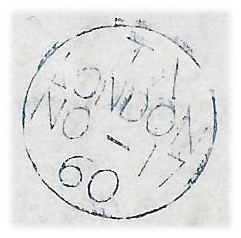
Colin also added that the lone marking on the back, dated November 17, 1860, confirms that this letter was sent on the evening despatch from the post office. This confirms for us that a 1 cent late fee was required to get this letter on its way. Colin suggested this resource for persons who might like to learn more about these late fees and Ian Gibbons chimed in with this short write-up for those who might like to view a mini-exhibit of this sort of material.

And, speaking of things that were late, Stephen Teuma was kind enough to point out that the square London marking on the back of this folded letter signified that the letter was "too late" for the last mail of the day.
There are actually two possibilities here. First, it is possible the letter was received at the post office after the train or carriage had physically left with the mail. Or, it is possible that this person was unwilling to pay a late fee for the privilege of having the postal clerk make an exception and prepare the letter for travel even though the mail window had closed.
And yes, this topic is enough fun that I am sure there will be a future Postal History Sunday dedicated to it.
A Couple of Useful Resources
Postal history and philately (stamp collecting) are topic areas that are blessed with all sorts of resource material, including articles and books by others who also love these subjects.
Here is a resource that I have used on and off to help me read some of the older hand-writing I come across. Of course, it doesn't always result in understanding all of the scribbles and scrawls, but it certainly can give a person a start. Someone, I no longer remember who, shared this in a forum for all to use. So, I share it again here - with the attribution that came with the image.
Yes, I know this one is not directly connected to the Facebook group. But, I'll share it there later so there is a connection.

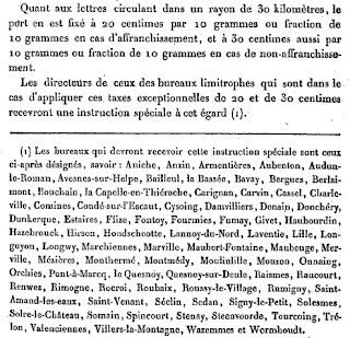
Then, there is the possibility that someone will introduce you to a tool that might be useful for future research. Manny Brautigam mentioned the yandex translation tool. It will take an image and attempt to translate it for you. Manny illustrated how it worked with this image, written in French:
The result, if you care to view it, is shown below. Of course, it is far from perfect. Some of the content is not successfully translated and some of the content should not have been translated. Most of the text under the line is a list of town names. Translating them doesn't help. For example, Trelon becomes "very-lon."
Still, it never hurts to have more tools in the tool box - and this one is pretty good. I am grateful for Manny's suggestion! But, it's even better if you have some skills of your own to supplement their effectiveness so you can recognize where they fall short.
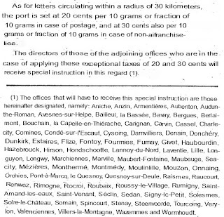
Yandex appears to work fairly well for documents with printed language, but it isn't made to handle handwriting. I believe there are tools in development that can work with those sorts of images but I am not personally aware of them at this moment.
Translate this
Sometimes it's just nice to know someone who can not only read a different language, but they also have some knowledge of postal history. After all, it's one thing to give a literal translation and it's quite another to give one that understands the context of what is going on (and what the person who is asking for the translation wants to know).
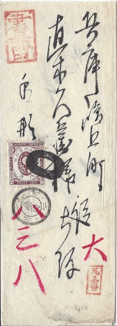
Kenneth Bryson has often helped when there are questions about Japanese postal history items. With his help, I was able to confirm that this is a registered letter (note the red marking at top left). In his words, this is what we are seeing:
The Old Koban 8-sen stamp pays the 2 sen regular rate plus the 6 sen registration fee. It has a large Osaka "Bota" cancellation and a double-circle datestamp of the Shimanouchi branch post office in Osaka, dated in accordance with 20 July 1886. The addressee is a person in Shimagami town, Hyogo district (presently Kobe city).
Kenneth also kindly reminded me that the correct orientation to read this letter is as shown above, but when it comes to the limitations of blog layouts, I still find myself showing you the back of the cover this way.
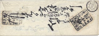
Kenneth was also willing to give information for the writing and markings on the back.
The black handstamps identify a business in Osaka. The circular datestamp is the Kobe office receiver showing that it arrived in Kobe in the afternoon on 20 July.
At some point in my life, I had read something about the red marking indicating registration. At some other point in my life, I became aware of the 6 sen registration fee. But, of course, I couldn't even begin to be sure if those were pieces of real knowledge or just something I made up. It's moments like that when you are reminded that the social side of philately can save you from foolishly assuming you know something you don't!
It never hurts to have a different perspective

Shown above is an item that I have pretty well "surrounded" when it comes to my own personal understanding. In fact, you can find a pretty good explanation here. The short explanation is that this 1864 has 12 cuartos in postage to pay for a simple letter from Spain to France. The French, in retaliation for a similar Spanish charge on letters from France, charged an additional 5 centimes from the recipient of the letter.
Ralf Reinhold chimed in again with this explanation:
This 5 centimes "droit de factage" had the following meaning: Between 2 February 1860 and 15 July 1869, letters from Spain to France were subject to an additional charge of 5 centimes, which the recipient had to pay. The background was that, despite the Spanish-French postal treaty of 1859 (in force since 2.2.1860), a delivery charge of 1 cuarto per letter continued to be payable to the deliverer in Spain for incoming mail from France (derecho de cartero). Therefore, France charged all letters from Spain with a corresponding "droit de factage" of 5 centimes, which was shown both in handwriting and by means of this special 5 c tax stamp. When the delivery charge of 1 cuarto for letters from abroad was abolished in Spain on July 2, 1869, France also cancelled its delivery charge again as of July 15, 1869.
Sometimes, when I write a Postal History Sunday, I do purposely leave out some details to keep the story accessible to as many readers as possible. But, it is possible that this might leave out details that are both interesting and, possibly, critical. It's very difficult to do better than this short description provided by Ralf - so I thought I'd share it here.
Outside Expertise

I've said it before and I'll say it again - postal history is a huge topic and it isn't hard to find yourself outside of your comfort zone. That may be the best reason why it helps to be prepared to listen to others when they offer their own expertise.
This letter is definitely outside of my normal comfort zone. But, it's not as if I can't figure some of it out.
This letter was sent from South Africa in 1935 and the postage stamps did not properly prepay the postage required for it to be sent to the United States. The T "Taxe" marking at the right of the envelope was the international method to pass on recognition that postage (taxe) was due. The 2 cent US postage due stamp shows payment of that postage in US currency.
According to the Universal Postal Union (UPU), rates were based off of French currency and then converted to local currency. So, the "T 10 c" refers to 10 French centimes. One US cent was equal to five French centimes. So, 2 US cents were due from the recipient to pay for this letter on arrival.
What I did not know was the postage rate required for a person in South Africa to fully prepay a letter. Andrew Massyn filled in that gap in knowledge, telling me that the rate was 3d (3 pence) to other UPU countries. Only 2 pence in postage was paid, so the 1 penny difference is doubled as a penalty for the underpayment.
At this point, it is tempting to grumble about how unfair it is to charge extra for what was likely an honest mistake. But, once you consider how much more labor was required to determine and then collect short paid or unpaid amounts, it becomes clear why this practice was followed.
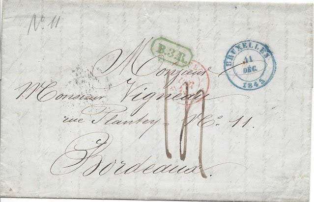
Then there's this item that I've written about in the past. This letter that was sent from Brussels, Belgium to Bordeaux, France, in 1845. My write-up in the prior Postal History Sunday is accurate and pretty well done. But, Gregg Redner offered his detailed knowledge on Belgian postal history to point out that the green "B.3.R." marking is an indication that the letter traveled on the railroad through Mons, Belgium.
This is a good reminder that postal markings during the 1850s, 60s and 70s often have meanings that are not immediately apparent unless you have in depth knowledge about them. There are so many markings over so much time for so many places that no one person is going to remember them all.

Then there is this interesting item that has appeared now and again in this blog. Gary Douglas recognized the font of the text on this tiny envelope and shared that there were typewriters that printed in capital letters only.
Persons with expertise in typewriters can figure out what sort of typewriter was used based on some of the characters and how they are represented. Gary suggested that we take note of the letters "O" and "R", as well as the number "8." You will see gaps or slots in those characters that run vertically, which can help us determine the type of machine.

Image Gary Douglas
Gary purchased a typewriter with slots that run horizontally for these characters from a railroad museum. The keyboard can be seen above. But it is is not hard to imagine a typewriter that looks fairly similar to this one being used to put the mailing address on each envelope. It certainly helps to solve the problem with poor handwriting on the address panel of a cover.
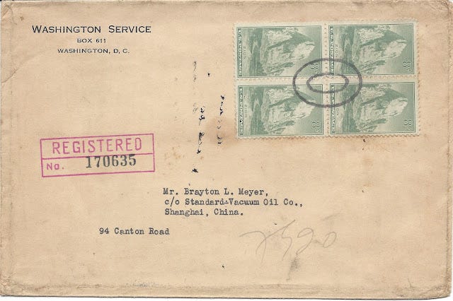
And, Paul Davey, provided a bit more depth to this large envelope mailed from the US to China in the 1930s. According to Paul, the Brayton Meyer, Standard Vacuum Oil Company received a significant amount of mail that is now in collectors' hands. The company is a predecessor to ExxonMobil.
This is a good reminder that postal historians have gained much knowledge from correspondences to a relative few number of businesses that kept material over a period of time. These collections of postal materials provide opportunities to search for patterns as to how mail was handled, allowing us to understand what was normal - and what was exceptional.

In part, because of this correspondence, we know that the piece of torn paper adhered to the back of the envelope is normal for a piece of registered mail. This matches up nicely with an overweight letter requiring 17 cents of postage for the cost of a piece of letter mail plus the 15 cent registration fee.
And there you are, just a few examples of the ways connections to other postal historians can help build the depth of understanding one person has. As always, I am grateful to these people, and many others, who have willingly shared their knowledge and opinions about postal history and all the subject material that each item can connect to.
I hope you were entertained as we explored everything from markings on late mail to typewriters, pianos and handwriting. And even if you weren't entertained, maybe you learned something new. Either way, I'll count that as a win! Have a great day and fine week to come.
-----------
Postal History Sunday is published each week at both the Genuine Faux Farm blog and the GFF Postal History blog. If you are interested in prior entries, you can view them, starting with the most recent, at this location.


