Welcome to this week’s edition of Postal History Sunday!
I’m going to start by addressing the elephant in the room and then we’ll move on from there. Yes, Postal History Sunday has a new look and a new location. And, it also has the ability to allow you to subscribe to receive these weekly articles each Sunday via email!
If you follow the links to subscribe, there will be a pop-up box that will ask you to “pledge” an amount for future PHS work. If you want a free subscription, you only need to select the $0 pledge amount. If you believe that you would be willing to pay a subscription price for Postal History Sunday, you can choose one of the amounts given. At present, I have not set anything up to accept subscription payments. However, if there is interest expressed with pledges, I will set up that option. You can choose to follow on that pledge (or not) with a paid subscription at that time.
To make it very clear, I will ALWAYS maintain a free subscription option. Everyone is welcome here. However, I am considering adding this voluntary payment opportunity for those who want to support my writing efforts with some funding. We’ll see how things go as we move forward.
And now that the elephant is blushing because we gave it so much attention, let’s move on to the fun stuff!
A little color to keep it fresh
This week I wanted to keep things on the lighter side and talk about some covers that I like because I think they LOOK GOOD. I’ve talked about the characteristics that make a cover attractive in a PHS titled Curb Appeal, but that doesn’t mean I can’t show you more covers I find attractive and tell you why I think they look nice.
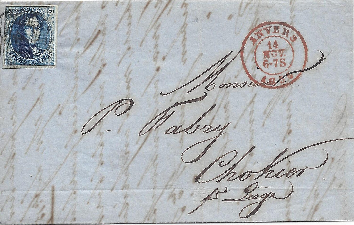
Shown above is a folded letter that was mailed in Anvers (Antwerp), Belgium, on Nov 14, 1855. There is a 20 centime postage stamp at the top left that pays the proper postage for an internal simple letter (no more than 10 grams in weight) that traveled more than 30 km to get to its destination.
The destination is Chokier, Belgium, which was (and still is) a small village near Jemeppe. Chokier may be best known for the Château de Chokier or Chokier Castle that looks overlooks the town by the river Meuse.
The address is given as “Monsieur P. Fabry, Chokier, pr Liege.” Essentially, the sender is telling the post office that Chokier is NEAR (pres) Liege. And, at the time, Chokier was too small to have its own post office, so the receiving postmark on the back is for nearby Jemeppe, which is located between Chokier and Liege.
So, what makes this particular cover attractive to me? The hand-writing is neat and easy to read. There’s even just enough flourish in the penmanship to add a little artistry to the address. And there’s a fair amount of color here. The blue paper and the red Anvers postmark really stand out. And it doesn’t hurt that the postmarks aren’t smudged and the cancellation on the stamp is light enough that I can see its design if I want to.
The condition of the whole item is very good - and that can count for a lot to a postal historian. But, for some reason, the balance of color and the composition of the elements on this particular piece works for me. Even the ink that bleeds through the front from the contents on the inside of the sheet feel like they add some depth.
I will readily admit that this particular item doesn’t have a big, grand story to go with it like this one does. And, it’s not an uncommon piece of postal history like this one. It’s simply a nice, sound, attractive example of what a typical piece of mail sent from Anvers to Chokier would look like in 1855. It clearly illustrates what a typical mail item looks like for that time and place.
The eye of the beholder
Tammy and I have sometimes allowed ourselves, after long work days, to sit and watch Antiques Roadshow on Iowa Public Television. And, if you’ve watched that show, you’ll probably understand exactly what I am going to say next. Sometimes we are surprised when the expert gushes over a particular item and exclaims how attractive and beautiful it is.
Sometimes we look at each other with raised eyebrows as if to say, “please, please… don’t tell me you like THAT!”
So it would not surprise me if some people who read this Postal History Sunday might be inclined to roll their eyes at my proclamations of attractiveness - at least as far as a piece of postal history goes. And that’s okay. But, let me try to explain a bit more.
I have long appreciated the craftsmanship and artwork of early postage stamps. So, of course, I like it when there are some nice examples of them on a cover. At one point in time, I dabbled in calligraphy, so I am naturally attracted to interesting lettering. My Dad was employed as a printer and also sold paper to printers, so I might come about some of this attraction to paper artifacts naturally.
So, why did I select this second cover?
Sometimes, I see something from a distance or I view a thumbnail image and I can tell that I’m going to like an item - even if I didn’t know much about it at the time. There is some nice color on this item. It looks clean. The handwriting is clear. The balance of the elements is good. And, aside from the added pencil marking, it just looks nice to me.
It was mailed in Paris on Oct 18, 1873 to Mosel in the Alsace-Lorraine region. This area annexed by Germany after France lost the 1870-71 conflict between the two nations. The cost of postage for a letter from France to Germany was 40 centimes per 10 grams (effective May 25, 1872 to December 31, 1875). The two postage stamps, one for 15 centimes and the other for 25 centimes, properly paid for this letter to get to its destination.
Once again, it’s not a particularly uncommon item. I have yet to discover some amazing story that connects to it. But, I like it. And that’s a good enough.
Selective viewing
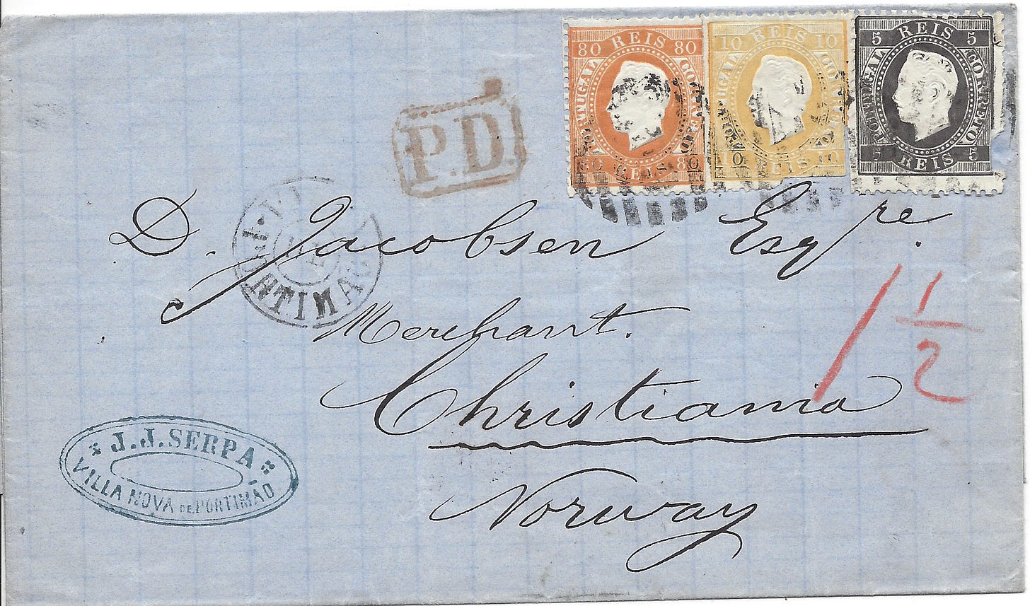
Here is another item I find attractive for many of the same reasons as the other two items I’ve featured today. There might also be a theme with blue paper on the items I’ve selected. And, if there has been, it was not intentional. Perhaps I have learned something about myself…
It’s interesting to note that blue paper was typically created by rag stock (discarded cloth) that had been colored with indigo dyes. It was not until 1843 that wood pulp was introduced as an option to create paper. Prior to that, rags were the most common resource that was pulped and spread into the papers used at the time. However, this also accounted for the relative scarcity of paper, since there was not always enough rag stock available to meet paper demand.
If you would like to learn a bit more, here is a very nice summary time line by the American Institute for Conservation for the history of blue paper.
This third folded letter is actually just the cover sheet and there are no contents for me to view and explore. It was mailed in Portugal in 1874 and sent to Christiania (Oslo), Norway. Unfortunately for me (and maybe for you), I have yet to identify a resource to help me with the Portuguese postage rates of the time. But, I still like it and I look forward to learning more about it.
There is, however, something more to be said about selective viewing here. I try not to look too closely at the postage stamps on this particular cover. Clearly, the person who separated them from the sheet of stamps had a little difficulty and the stamps are… um… missing a bit of themselves, shall we say.
But, then again, perfection is not necessary for us to find something attractive. And, with that truth, I think we can all breathe a sigh of relief.
Some want more sparkle
Some people prefer a flashier appearance than many of the covers I have shown thus far. Maybe, for you, it’s not about the hand-writing or the postage stamp. Instead, you want more images! More color!
So, here you go.
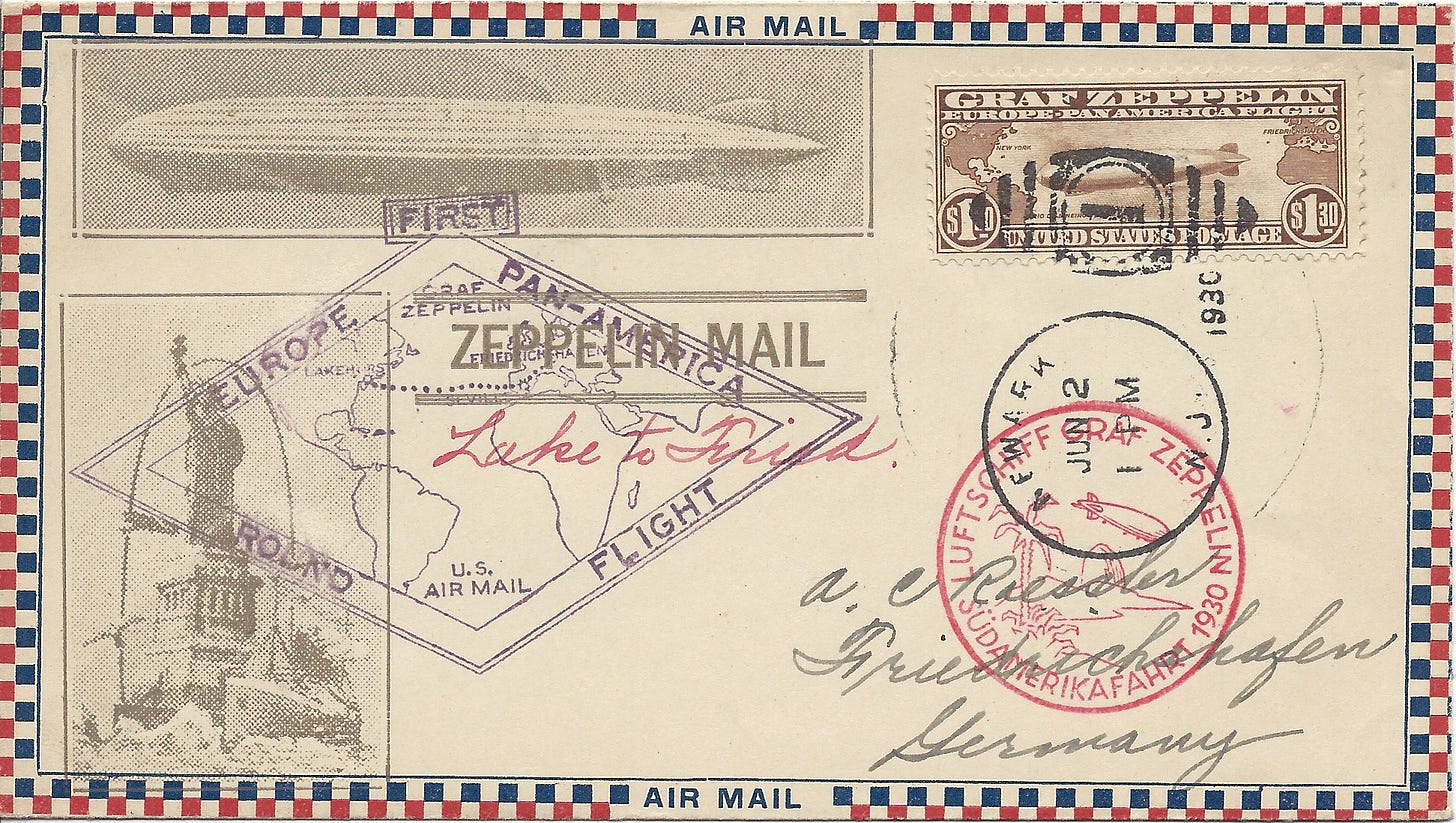
This envelope (not in my collection) was flown on the German airship named Graf Zeppelin in 1930. We’ve got a postage stamp that shows an image of an airship. There’s an larger image of an airship along with a stylized Statue of Liberty. There is a colorful checkered border that was often used to indicate that airmail was the preferred service for the letter. And, there are purple and red hand-stamps called “cachets” that commemorate this special flight for the Graf Zeppelin.
The zeppelin flights and the US zeppelin stamps were a great opportunity to raise funds by encouraging philatelists (stamp collectors) to buy the stamps and create commemorative covers. The cover shown above was actually sent by A.C. Roessler to himself. Roessler is known to have created many covers that celebrated the early development of air mail. He was also accused and convicted of fraudulant activities, and may have been guilty of other, similar, crimes.
There were instances where Roessler was accused of creating or forging “extra” covers for certain events so he could fill a demand that exceeded the supply.
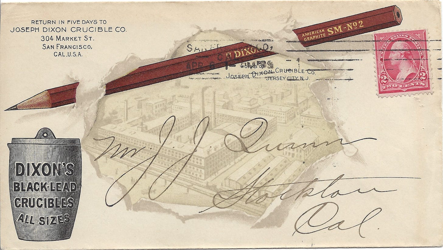
Here’s another one that might appeal to a broader audience!
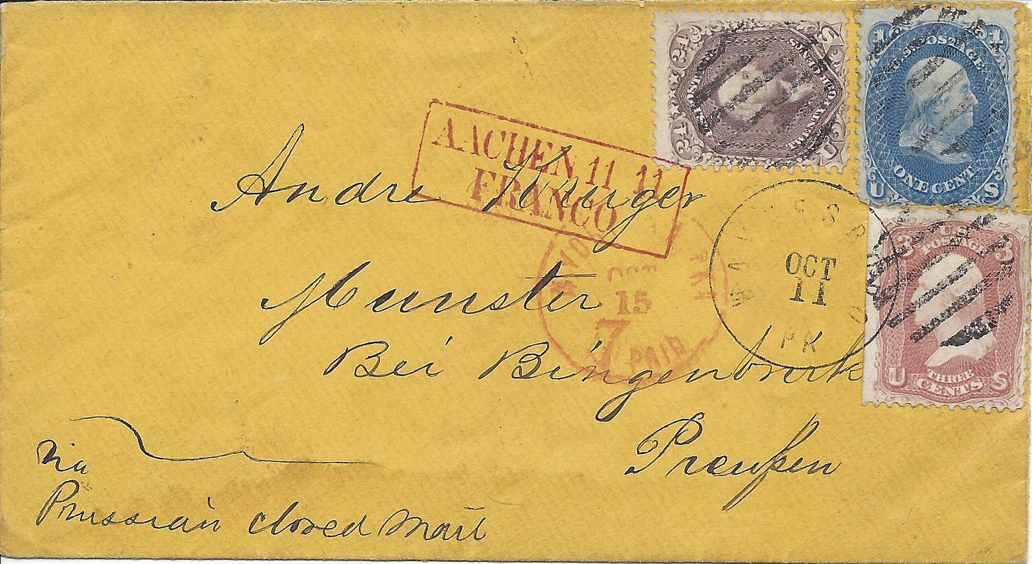
It’s brighter and bolder. And it’s easy to appreciate a cover that looks like a pencil has pushed through the paper. I featured this particular cover in a September, 2021 Postal History Sunday if you would like to learn more about it.
Once again, the cover is in excellent condition. The design is attractive and the balance with the address, postmark and postage stamp works well.
Stories add depth to the beauty
But, my eyes still get pulled to the 1850s to 1870s material. I like the colors, which are created by organic sources rather than some of the synthetic materials we would see in more modern papers and inks. The papers, because they are more frequently made of ragstock, feel softer to the touch and are often more durable. And, I like the fine engraving in the designs of the postage stamps during that period.
Perhaps you have different ideas of what is attractive in a postal history item than I do - and that is okay. Or maybe you’ve developed a case of eye strain because you’ve been rolling your eyes at me. You may still fail to see how I could find old envelopes, handwriting, and paper to be beautiful.
That’s okay too.
That’s why I’m going to conclude this article with a story that is connected to this cover by geography.
Please note that this letter is addressed to Munster bei (near) Bingerbruck - then in Prussia. Bingen and Bingerbruck were a key crossing point between the Prussian state and Hessian territory, so it shows up on various pieces of postal history during the 1850s-70s time period.
Bingen lies on the east side of the Nahe River (left side on the photo below) and Bingerbrück on the west side (right side).
The picture above comes from an online sales lot on a popular auction site, and the date is purported to be circa 1860. You can see the rail bridge in the foreground over the Nahe. The photo itself must have been taken from the high ground on the other side of the Rhine River.
After Napoleon's defeat in 1814, the Congress of Vienna, set boundaries that made Bingen and Bingerbruck key border towns between the Prussian Rhineland and the Grand Duchy of Hesse. Just by looking at the photos a person can see how this might be a key river crossing.
Bonus Material - The Mouse Tower

There is an island near Bingen where an old tower still stands - and it bears the name Mäuseturm - which is translated as "the Mouse Tower." According to the current city of Bingen, this name may actually be a alteration of the name based on a High German word that made reference to this being a watchtower.
In the present day, this tower may be more well known for its connection to a legend that features the Archbishop of Mentz who treated the peasantry cruelly, murdering many of the poor to prevent them from eating too much of the food that was in short supply. Archbishop Hatto fled to this tower to escape an army of mice, who pursued him there - he was then devoured by the mice as God's judgement for his wicked ways.
This poem by Richard Southey provides one version of that legend - for the whole poem, take the link. Here is a portion of that work:
Then, when he saw it could hold no more, Bishop Hatto he made fast the door; And whilst for mercy on Christ they call, He set fire to the barn, and burnt them all. “I’ faith, ’t is an excellent bonfire!” quoth he; “And the country is greatly obliged to me For ridding it, in these times forlorn, Of rats that only consume the corn.”
Thank you for joining me this week for Postal History Sunday. Have a great remainder of your day and a fine week to come!
Additional Reading
I have heard from some people that one Postal History Sunday isn’t enough on some weekends. So, here are links to other PHS that are related to today’s topic.
The Mighty Pencil - PHS #58
Digging In - PHS #47
Visiting the Arctic Circle - PHS #121
Postal History Sunday is featured weekly on this Substack publication. If you take this link, you can view every edition of Postal History Sunday, starting with the most recent publication. Some Postal History Sunday publications may also be found under my profile at Medium, if you have interest.




Maybe it's the Editor/Designer in me, but Rob, of goodness sake--gray text is not fancy. It's hard to read. And as creative as editors can get (or think we can anyway) it should never be forgotten that text is to be READ! Not admired!